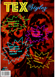
This was the front cover of my preliminary task. I did not have any knowledge about conventions of a magazine. I also did'nt have ggod skills with using technology e.g. photoshop, cameras and blogs. On my front cover i did not have a photograph or anything which would attract the audience. This would not be recognised as a magazine. I also dont have a colour theme so it all looks unprofessional. I also did'nt have a puff or use language to attract the audience to the front cover. Comparing this to my music magazines front cover i think i have leant much more. I also understand what needs to be on a front cover through analysing and annotating other magazines.
Monday, 26 April 2010
Subscribe to:
Post Comments (Atom)


0 comments:
Post a Comment