CLICK HERE FOR BLOGGER TEMPLATES AND MYSPACE LAYOUTS »

Search This Blog

Sunday 2 May 2010

evaluation

n

Monday 26 April 2010

PRELIMINARY TASK INTERVIEW PAGE

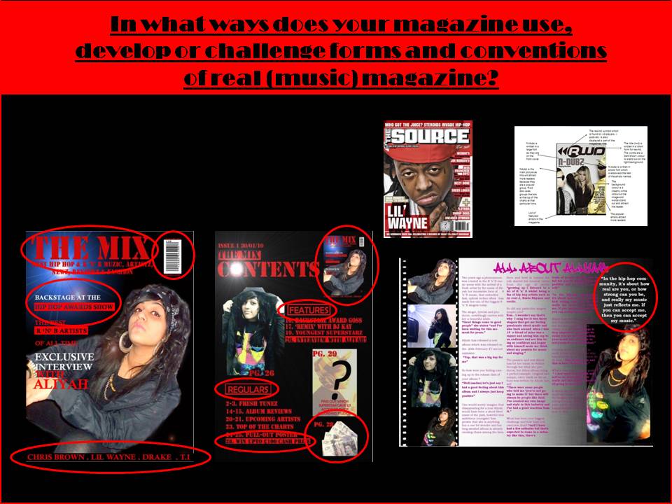
In my interview page i did not have a two page spread or use most conventions which a magazine would have for an interview. Now that I've analysed and ssen a lot of interview from magazines I t understand what needs to be put into an interview page. In my music magazine I used images of the artist, a pull quote, double page spread, colour theme, relevant font and I had a chatty editorial which made the interview realistic. I used informal languag which my target audience would be familiar with.
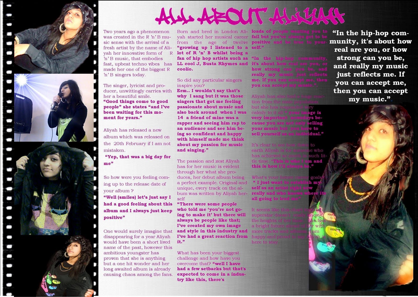
PRELIMINARY TASK CONTENTS PAGE


My contents page for my preliminary task did not have clear layout i also did not structure it well. I had little knowledge about the conventions of a contents page of a magazine. In my music magazines contents page i've developed my skills much further in editing my images using photoshop and using better fonts. I also had a recognisable colour theme through the magazine. In the preliminary contents page i did'nt outline the main articles well in my music magazine i've used a convention that most magazines use which is using some sort of highlighting style to emphasise the articles to attract your audience. I think i have worked much better on my music magazine and have much more detail that a contents page should have.

PRELIMINARY TASK FRONT COVER

This was the front cover of my preliminary task.  I did not have any knowledge about conventions of a magazine. I also did'nt have ggod skills with using technology e.g. photoshop, cameras and blogs. On my front cover i did not have a photograph or anything which would attract the audience. This would not be recognised as a magazine. I also dont have a colour theme so it all looks unprofessional. I also did'nt have a puff or use language to attract the audience to the front cover. Comparing this to my music magazines front cover i think i have leant much more. I also understand what needs to be on a front cover through analysing and annotating other magazines.

CONSTRUCTING INTERVIEW PAGE

When making my contents page I used photoshop to create a film strip and then added different images of the artist. In one of the image you can see the artist holding a microphone i wanted to add something more to this image to create a atmosphere which went with the image. So i added in a supernova light from photoshop. I also used a graffiti font style which my target audience can realte to as they would be familiar this type of style as this is what some teenagers use to express themselves.

CONSTRUCTING CONTENTS PAGE

On my front cover i had one main image of the artists and two other images. The first image is of a phtograph which i took of someone "artist"  but i deliberately added a washed out effect so that the person was unclear. I added a caption to the image saying "find out which superstar gave us access to thier recording studios!" I thought this would attract my audience and draw them into my magazine it also increases the readers expectation. Another photograph i took was of a bunch of notes which made the cash prize article look more realistic. I also done this to attract my target audience.

Sunday 25 April 2010

CONSTRUCTING FRONT COVER

I used photoshop to construct the front cover. First I used the magnetic lasso tool to cut around the image and then i copied it onto a plain black background layer. Then i used the smudge tool to smoothe out the edges and make it look neater. I then wanted to create a night-time look so i added a lighting effect changing the light colours to blue and white to get the right colours. I also used a photoshop font "stencil std" i also added the puff of the magazine i chose to do it in red as this was  one of the colours from my magazines colour theme.