CLICK HERE FOR BLOGGER TEMPLATES AND MYSPACE LAYOUTS »

Search This Blog

Monday 26 April 2010

PRELIMINARY TASK INTERVIEW PAGE

In my interview page i did not have a two page spread or use most conventions which a magazine would have for an interview. Now that I've analysed and ssen a lot of interview from magazines I t understand what needs to be put into an interview page. In my music magazine I used images of the artist, a pull quote, double page spread, colour theme, relevant font and I had a chatty editorial which made the interview realistic. I used informal languag which my target audience would be familiar with.

PRELIMINARY TASK CONTENTS PAGE


My contents page for my preliminary task did not have clear layout i also did not structure it well. I had little knowledge about the conventions of a contents page of a magazine. In my music magazines contents page i've developed my skills much further in editing my images using photoshop and using better fonts. I also had a recognisable colour theme through the magazine. In the preliminary contents page i did'nt outline the main articles well in my music magazine i've used a convention that most magazines use which is using some sort of highlighting style to emphasise the articles to attract your audience. I think i have worked much better on my music magazine and have much more detail that a contents page should have.

PRELIMINARY TASK FRONT COVER

This was the front cover of my preliminary task.  I did not have any knowledge about conventions of a magazine. I also did'nt have ggod skills with using technology e.g. photoshop, cameras and blogs. On my front cover i did not have a photograph or anything which would attract the audience. This would not be recognised as a magazine. I also dont have a colour theme so it all looks unprofessional. I also did'nt have a puff or use language to attract the audience to the front cover. Comparing this to my music magazines front cover i think i have leant much more. I also understand what needs to be on a front cover through analysing and annotating other magazines.

CONSTRUCTING INTERVIEW PAGE

When making my contents page I used photoshop to create a film strip and then added different images of the artist. In one of the image you can see the artist holding a microphone i wanted to add something more to this image to create a atmosphere which went with the image. So i added in a supernova light from photoshop. I also used a graffiti font style which my target audience can realte to as they would be familiar this type of style as this is what some teenagers use to express themselves.

CONSTRUCTING CONTENTS PAGE

On my front cover i had one main image of the artists and two other images. The first image is of a phtograph which i took of someone "artist"  but i deliberately added a washed out effect so that the person was unclear. I added a caption to the image saying "find out which superstar gave us access to thier recording studios!" I thought this would attract my audience and draw them into my magazine it also increases the readers expectation. Another photograph i took was of a bunch of notes which made the cash prize article look more realistic. I also done this to attract my target audience.

Sunday 25 April 2010

CONSTRUCTING FRONT COVER

I used photoshop to construct the front cover. First I used the magnetic lasso tool to cut around the image and then i copied it onto a plain black background layer. Then i used the smudge tool to smoothe out the edges and make it look neater. I then wanted to create a night-time look so i added a lighting effect changing the light colours to blue and white to get the right colours. I also used a photoshop font "stencil std" i also added the puff of the magazine i chose to do it in red as this was  one of the colours from my magazines colour theme.

FRONT COVER ANALYSIS

My magazine shows the convention of a magazine by a number of things;. Masthead , Strap line , contents page , double page spread , consistent layout, Target audience , Barcode , Price , Date of issue , Interview , Images , Features


I used these conventions because of audience expectation. The audience of my magazine would expect a magazine to have all the conventions listed above.

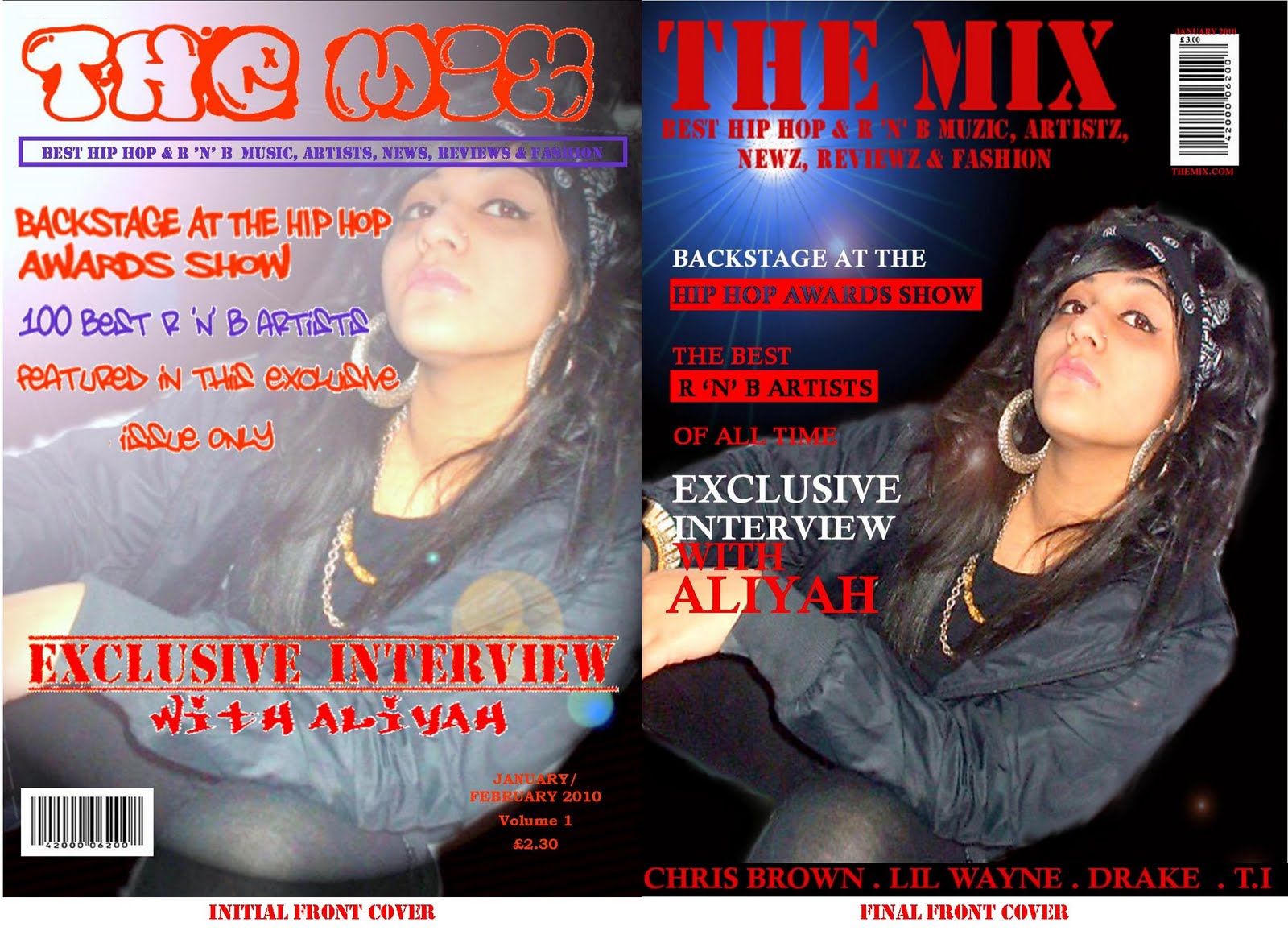
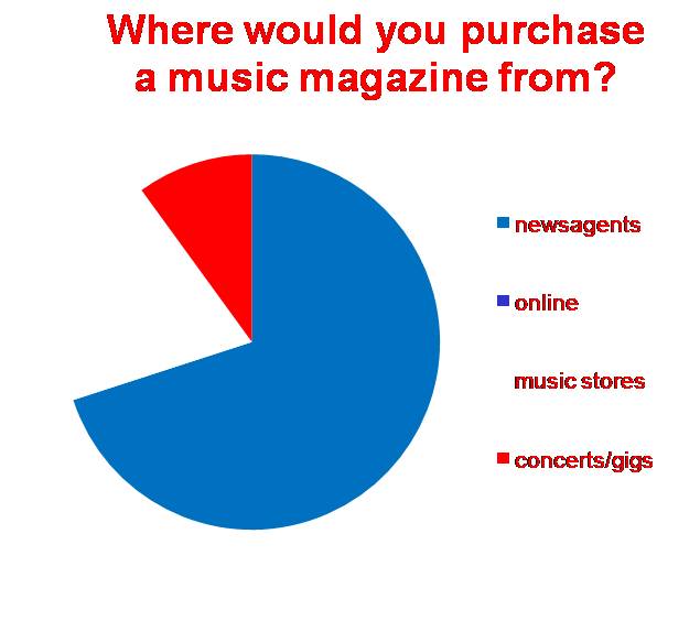
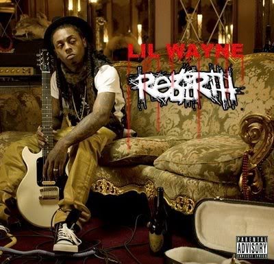
Use of colours by using a bright colour like red I made my magazine eye-catching and therefore attractive which to help consumers purchase your magazine. Most Hip Hop magazines like XXL and VIBE mostly also use red as the main colour in their chosen colour scheme. This is because the colour red easily draws attention. I also chose these colours as my target audience chose red as a main colour for the house style. As a result of my questionnaire.

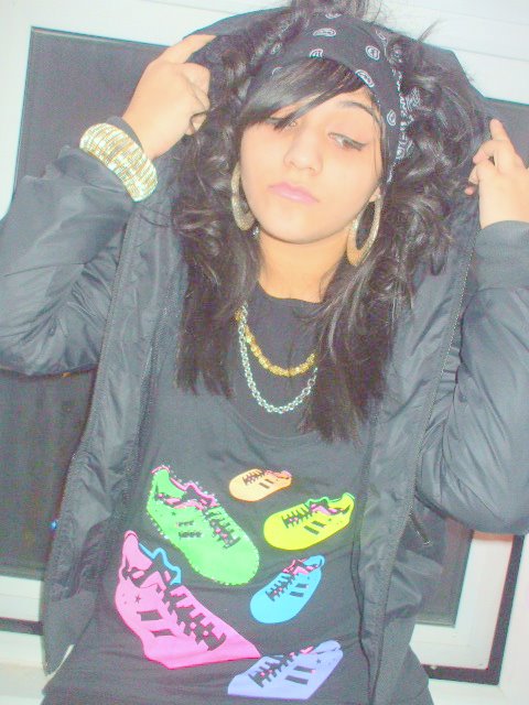
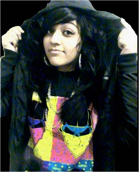
The main image also follows convention as the front cover image is a medium close up, which most hip –hop magazines use in order to show face expression, the body language of the image portrays a ‘bad’ attitude which is something that most hip hop artists would portray on cover page. The artist in my magazine wears and uses props and clothing such as chains, hoodies, bandanna and a microphone.

Hip hop is a male dominated genre of music but I have challenged that by using a female on the front cover. But I tried to make her image look as strong as male artists on the cover which will make my magazine stand out from other hip hop magazines.
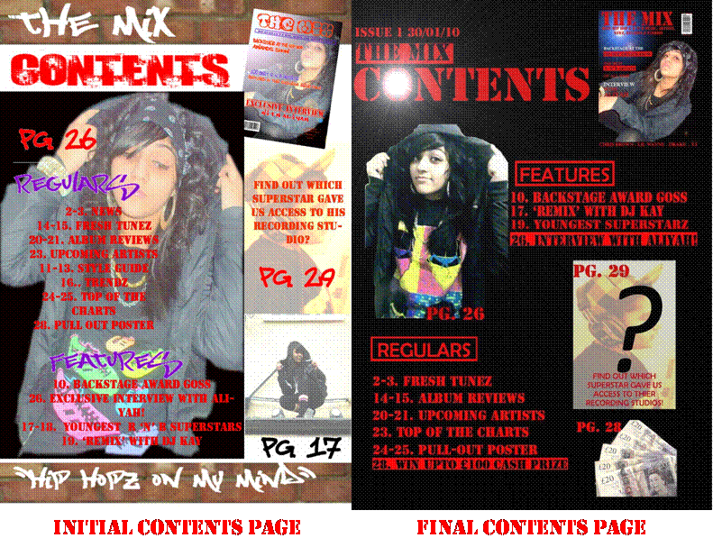
Puff In my magazine I used a puff as I wanted to add to my magazines brand identity. Adding a puff also makes the magazine more trustworthy and reliable giving more reasons for consumers to purchase the magazine as I am trying to attract young Hip Hop fans as they are my target audience. This represents my magazine as the best in the Hip Hop genre, so Hip Hop fans will be interested in buying my magazine. Other well known Hip Hop magazines also do this like XXL


I used language such as “exclusive” and “best”. These help to attract audiences as they make the magazine seem more trustworthy and interesting. These are used in other magazines to attract target audiences. E.g. The source, XXL and VIBE all use these words on the front cover as this is what persuades most audiences to buy the magazine.

My magazine is priced at £2.30 which I think is an ideal price for my audience as they are aged between 14-23 and mostly still in education and some would not want to buy a magazine which is over priced which means it costs less than other hip hop/r ‘n’ b magazines which will attract my target audience
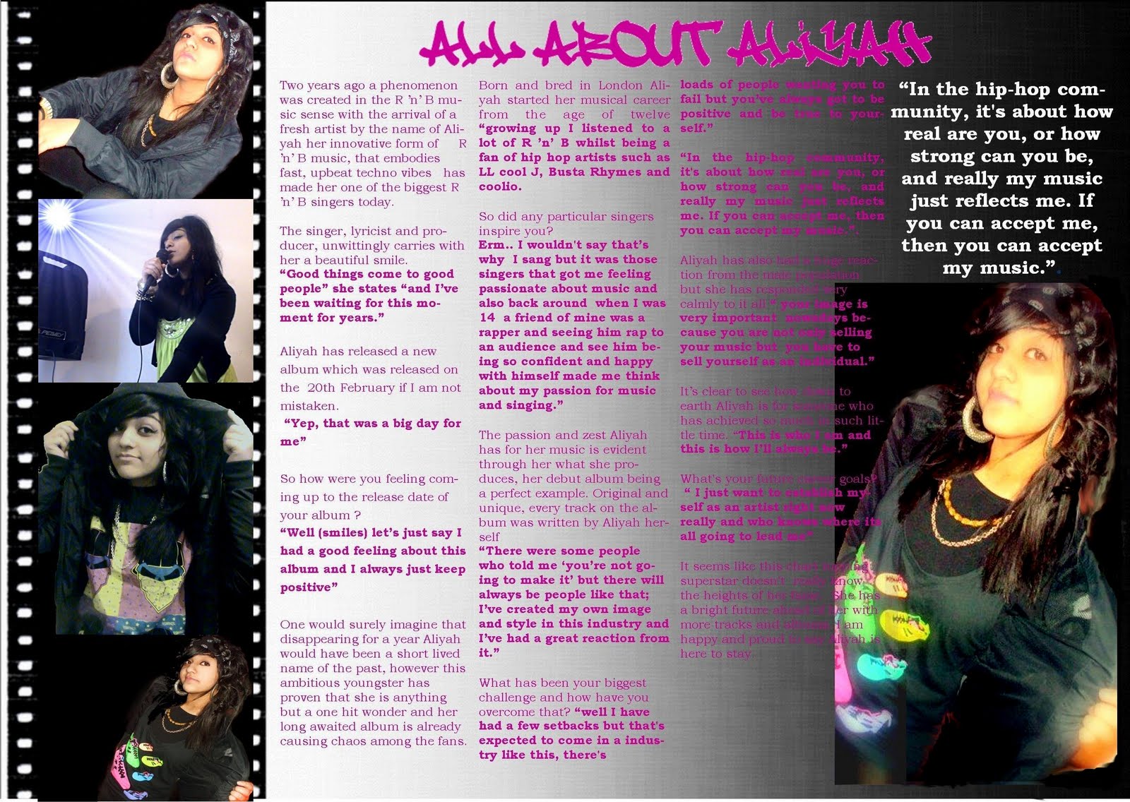
analysing other contents pages (mixmag)

I analysed the convention of the 'mixmag' magazine.

CONTENTS PAGE

I made a lot of changes to my contents page as the intial contents page was too crowded and i did not use most of the conventions i had seen in other magazines. I used too many colours and images. The font which i had downloaded was also unclear. On my initial contents page i centred the text which is not seen in most magazines. On my final contents page i aligned the text to the left ehich made it look much better. I also removed pictures to give the contents more space. I used a highlighting effect on the main articles which would stand out to the audience this would make them want to read on and be interested in the magazine. I put in a cash prize page which would attract my audience of 14-20 year olds.  I also used a font called stencil throughout the page instead of using downloading different fonts and using different colours. My contents page now looks more clearer and proffesional as i have not over-crowded it and it appeals to my target audience more.

INTERVIEW PAGE

For my interview page I added a film strip effect with different images of my artist. My editorial was detailed and i had a typical layout of three colomns per page. My images also showed my artist singing. I also used a pull quote which is a typical convention of an interview page as i saw from looking at other interview pages in magaznies. But in my initial interview page my images were of a low quality and not clear enough so for my final interview page i changed the images and used much clearer ones. This made the page look much better.

INTERVIEW PHOTOGRAPHY

For my magazine I have to take photgraphs of a hip hop/r 'n' b singer. I had to create a setting and use clothing which relates to hip hop. I dressed up my hip hop singer using chains, hoop ear-rings, a bandena and a hoodie. I used these certain itens to create a sterreo-typical looking hip hop artist. These are a few of the shots I usedfor my magazine. But some of the photographs were not suitable for the magazine as they were out of focus. And some shots did not have the right facial expression or posture. I wanted to create the same look as existing magazines would have. Most of the artists are laid back with a serious facial expression. This targets the audience and they can relate to the magazine.


Monday 19 April 2010

FRONT COVER

I made a lot of changes to my initial front cover as i wanted to add more conventions of a magazine I also had to make the magazine more sellable to my audience. Firstly i changed the font of my masthead "The mix" as the font i downloaded was not clear enough on my intial front cover and also the final font i used was much more clear and easier to read. So it will attract my audience more. I also made my main image much clearer and removed any effects made to it which sort of gave it a washed out look. I wanted to emphasise the main image more so i sharpened it in photoshop. In the backgroung of the cover i used a lighting effect which gave it a night look. In the initial front cover the image was zoomed in but i zoomed out of the image so that the layout would fit better and the image could have some space. I also thought the graffiti font and colours of the cover lines did not make the magazine look as professional as it could look. I changed the graffiti font as its also a typical style of hip hop it also did not look clear enough on the front cover. I also removed the purple colour from the front cover as i thought the front cover looked to crowded and busy. I added in a list of well-known hip hop artists names as this would also attract my target audience so my audience is familiar with these names. My final front cover is much more readable for my audience its not too busy and i think it looks much more professional. 

FRONT COVER ROUGH OUTLINE

This is a rough outline of what my front cover might look like.

LANGUAGE

Hip Hop and R 'n' B is usually associated with slang. My target audience also uses this language as it is language used frequently in the Hip Hop and youth culture. By using colloquial such language I am making it clear that my magazine is a Hip Hop one and I am also making it easier for my target audience to relate to.

RWD INTERVIEW ANALYSIS


The image image is of the group 'The Black Eyed Peas', however the image is telling us that the page is about Will-I-am, a member of the black eyed peas as he is in full cover where as the other members of the group are faded. The title of the story on the pages is not very large but reads 'will he won't he?' relating to the name of the artist. The colour scheme of the page is gold, silver, black and white, this relates to cleanness and modernness.


The ideas behind this double page spread is that of fans of the hip-hop genres. The ideas are modern ideas and hip hop is a very modern genre. The colour scheme being gold, silver, white and black represents the likes of the modern people as white space has become very popular in many different things such as properties, facilities as it gives off a clean modern feel, which I believe the magazine is trying to achieve with this double page spread.


Audience

The target audience of this magazine is the younger generation who are fans of the hip hop genre. I think the magazine is mainly aimed at the working class and middle class people as these are the people who listen too 'party' music, which this genre is often referred too. I think the magazine is aimed at male and female audiences as page is a of a neutral colour scheme and the genre represents both genders.


Reader Profile

Age 16- 25

Working or middle class

Male and Female

Hip Hop

Representation

The page is representing the artist as young which is shown through the colour scheme. They are also represented as being individual as each one of the group have a totally different look to each other and do not dress 'normal'. This is representing them, the genre and the audience, who are likely to want to be very individual too.


VIBE FRONT COVER ANALYSIS

This is the Title ‘Vibe’, it is in capitals making it visible and noticeable to the readers and is also very large making the magazine cover eye-catching. The colour of ‘Vibe’ is a neutral colour, white. This suggests how the audience varies appealing to both genders, being girls and boys of a teenage age range.


This is the Central Image ‘Chris Brown’. He has been airbrushed to come across perfect, faultless and natural, this will attract and appeal to teenage girls for the simple reason of finding him attractive and good-looking. The image may also appeal to a small percentage of boys as they may want to aspire and be like him. They are using the image of Chris Brown to sell the magazine.
The Main Colours of the magazine are White, Red, Black and Green. The colours help the magazine achieve its attractiveness and its appeal to the customers and audience. The magazine doesn’t look either confusing or chaotic which is why there are no more than 4 main colours. The bright and attractive choice of colours acheive the exciting styles that the teenage audience require.


This is a Puff ‘CD’s are dead...’ the text is again in capitals causing it catch the audience and customer’s attention. The Puff Box is a ridged circle shape and the colour is red. The colour red is a dominant, powerful advertising colour and will immediately catch eyes with the customers causing them to read and identify the Puff Box. The overall appearance of the Puff Box is very striking and bold.

TEST SHOTS FOR EACH CAMERA SHOT/ANGLE

These are photos which I have taken looking at these photographs will help me when I plan which  angles to take photgraphs from for my magazine.   

Two shot,         Low angle,         Mid shot,     Medium long shot,  Point of view shot,   Establishing shot


                                        Extreme Close up,   Close up,     Medium close up                                             

QUESTIONNAIRE

i conducted a questionnaire before the making of my magazine. I needed to find out what sort of genre, style, colours, artists and information my target audience would like to see in a magazine. I created this questionnaire as i wanted my magazine to target and attract my audience.
 RESULTS OF QUESTIONNAIRE