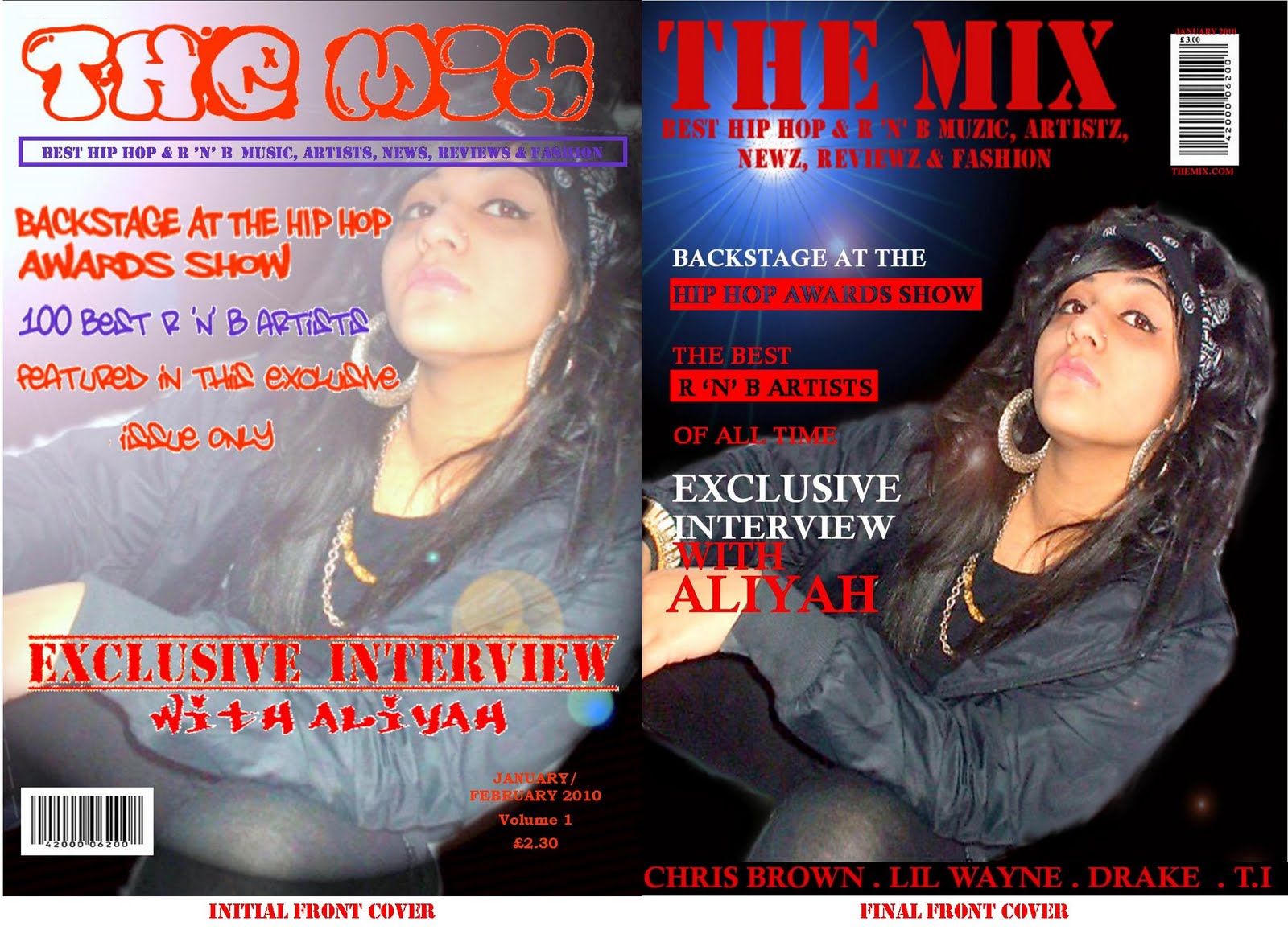
I made a lot of changes to my initial front cover as i wanted to add more conventions of a magazine I also had to make the magazine more sellable to my audience. Firstly i changed the font of my masthead "The mix" as the font i downloaded was not clear enough on my intial front cover and also the final font i used was much more clear and easier to read. So it will attract my audience more. I also made my main image much clearer and removed any effects made to it which sort of gave it a washed out look. I wanted to emphasise the main image more so i sharpened it in photoshop. In the backgroung of the cover i used a lighting effect which gave it a night look. In the initial front cover the image was zoomed in but i zoomed out of the image so that the layout would fit better and the image could have some space. I also thought the graffiti font and colours of the cover lines did not make the magazine look as professional as it could look. I changed the graffiti font as its also a typical style of hip hop it also did not look clear enough on the front cover. I also removed the purple colour from the front cover as i thought the front cover looked to crowded and busy. I added in a list of well-known hip hop artists names as this would also attract my target audience so my audience is familiar with these names. My final front cover is much more readable for my audience its not too busy and i think it looks much more professional.
0 comments:
Post a Comment