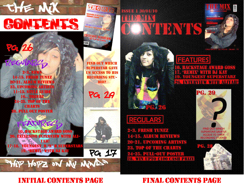
I made a lot of changes to my contents page as the intial contents page was too crowded and i did not use most of the conventions i had seen in other magazines. I used too many colours and images. The font which i had downloaded was also unclear. On my initial contents page i centred the text which is not seen in most magazines. On my final contents page i aligned the text to the left ehich made it look much better. I also removed pictures to give the contents more space. I used a highlighting effect on the main articles which would stand out to the audience this would make them want to read on and be interested in the magazine. I put in a cash prize page which would attract my audience of 14-20 year olds. I also used a font called stencil throughout the page instead of using downloading different fonts and using different colours. My contents page now looks more clearer and proffesional as i have not over-crowded it and it appeals to my target audience more.
0 comments:
Post a Comment